
Unlocking customer spend
Giving our customers a new way to unlock spending that works for them
Case study in progress. Please excuse the mess (and how’d you even find this page?)
Our highest-spending customers wanted a way to avoid frustrating declines and grow their business spending faster than their cards enabled them to.
Our new document-driven data refresh gives our agents a new tool that enables more spending on our cards while properly managing the financial risk for the business.
Overview
Team:
Capital One Small Business Card Charge Experiences
Project Details
Project Type:
Service Design
Research
Interaction Design
Design Systems
Vision Workshopping
Role:
Interaction Designer
Researcher
Workshop Planner & Facilitator
Platform:
Responsive Web
Tools:
Figma
Lucidspark
UserTesting
Key Results:
$17.5M Increase in Spending by Customers
85+ Completed XDR Cases
Design Timeline & Release:
MVP: March 2024 - July 2024, Released September 2024
Vision Workshop: August 2024
Getting declined is a frustrating experience, especially for high spending customers who expect their purchasing power to reflect their financial behavior. Repeated declines can erode trust in our cards and push customers toward competitors. To address this while managing risk, we designed a way for customers to share additional financial context, allowing Capital One to make more confident decisions while improving both customer and agent satisfaction.
Project Description
Interested in learning more? Scroll down to discover how this new feature enables higher customer satisfaction and spending on our cards, along with the process I took to bring this to life!
Designing the MVP
No preset spending limit can mean unexpected declines
Our 2 key products are “No Preset Spending Limit” cards, meaning that there’s no fixed credit line and their spending limit can change with each swipe of the card. Because of this, combined with its high level of purchasing power, there’s no displayed credit line on their account, due to risk and fraud reasons.
Since customers are unable to see a spending limit, they could get declined unexpectedly, delaying business purchases, causing frustration, and eroding their trust in us. When they call into Servicing, hoping to get an answer, they get even more frustrated since the agents don't have any specific insight into how to avoid this in the future, and can only ask them to make a payment if they can. This also leaves agents frustrated that they can’t help a customer. We wanted to provide agents with another tool that could help customers get the spending power they deserve.
Given the complexity of this project and coordination across more than 10 teams, constant communication was critical to keeping everyone aligned. From the start, we aligned on and documented a few key factors to keep delivery on track.
Target launch date: In partnership with product leadership and business teams, and accounting for design, engineering, and underwriting effort, we set a September MVP launch.
Scope alignment: With a four-month design window, we negotiated clear boundaries to keep the work manageable. This included limiting case volume to avoid overwhelming underwriting and initially offering the experience only to select customers who called in with spending power issues.
Feedback loops: I established weekly design syncs with engineering and product to maintain alignment and coordinated regularly with additional partner teams to surface changes early and keep documentation up to date.
Ensuring the success of a complex project
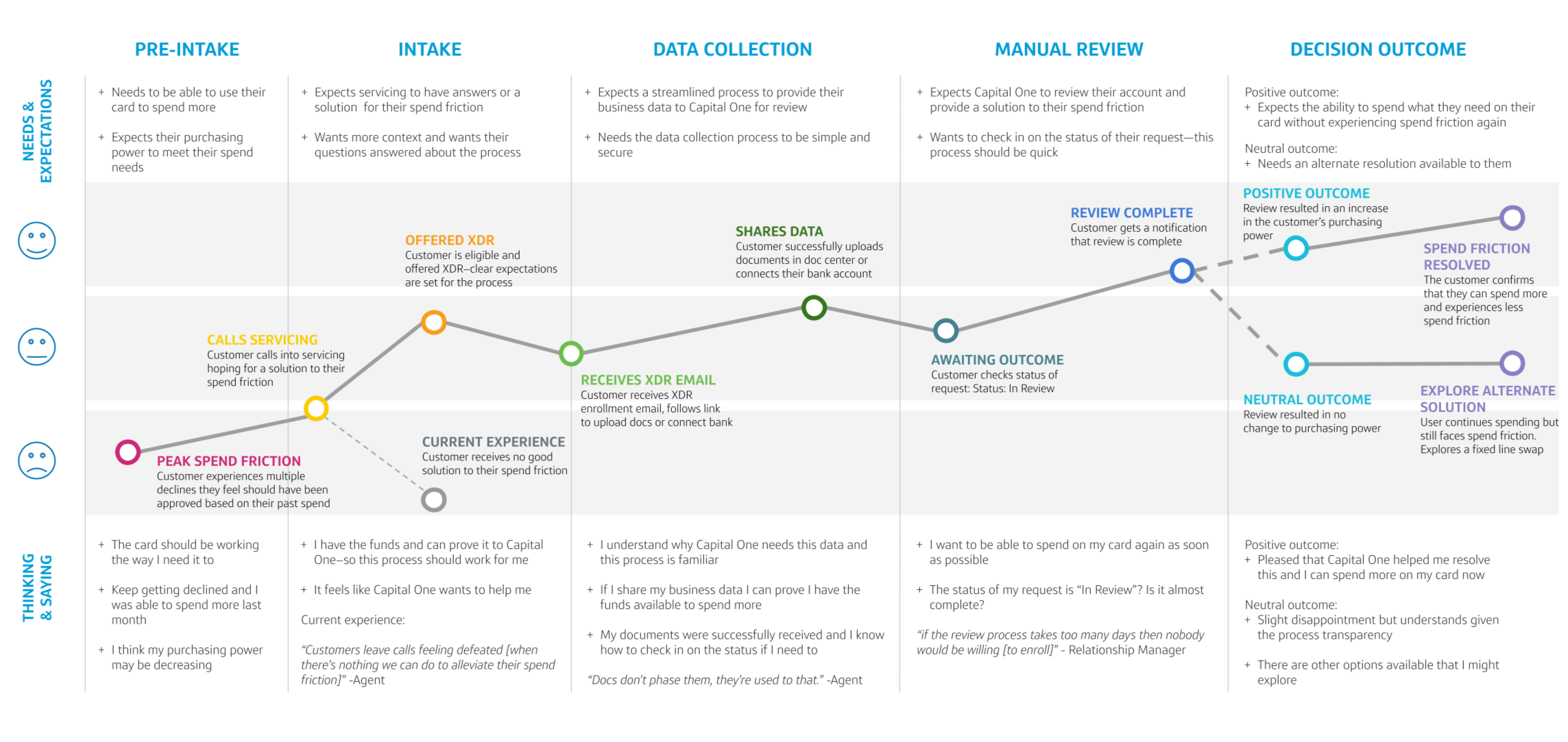
Mapping the ideal customer journey
Based on the agent research, I worked on mapping out the ideal customer journey, highlighting a customer’s needs and expectations throughout each step of the proposed journey, as well as their thought process. This highlighted the impact that Expanded Decline Resolution could have on the customer, given the transparency of the process.
Using a service blueprint to map all the complex touchpoints
Next, I worked with our Service Designer to map all back-end processes affected by XDR—from how underwriters review cases, to how our third-party vendor (Finicity) shares customer data, to how agents create and manage these cases. This process helped us gain a better understanding of all the moving parts in the project, beyond only the parts that had design needs. To achieve this, my service designer and I met with each impacted team individually to understand how their process currently works and what would need to change to enable XDR. Using the information gathered, I helped our service designer create a detailed service blueprint in Figma outlining the XDR process. It was shared broadly and became a foundational reference for identifying and coordinating required changes with key partners.
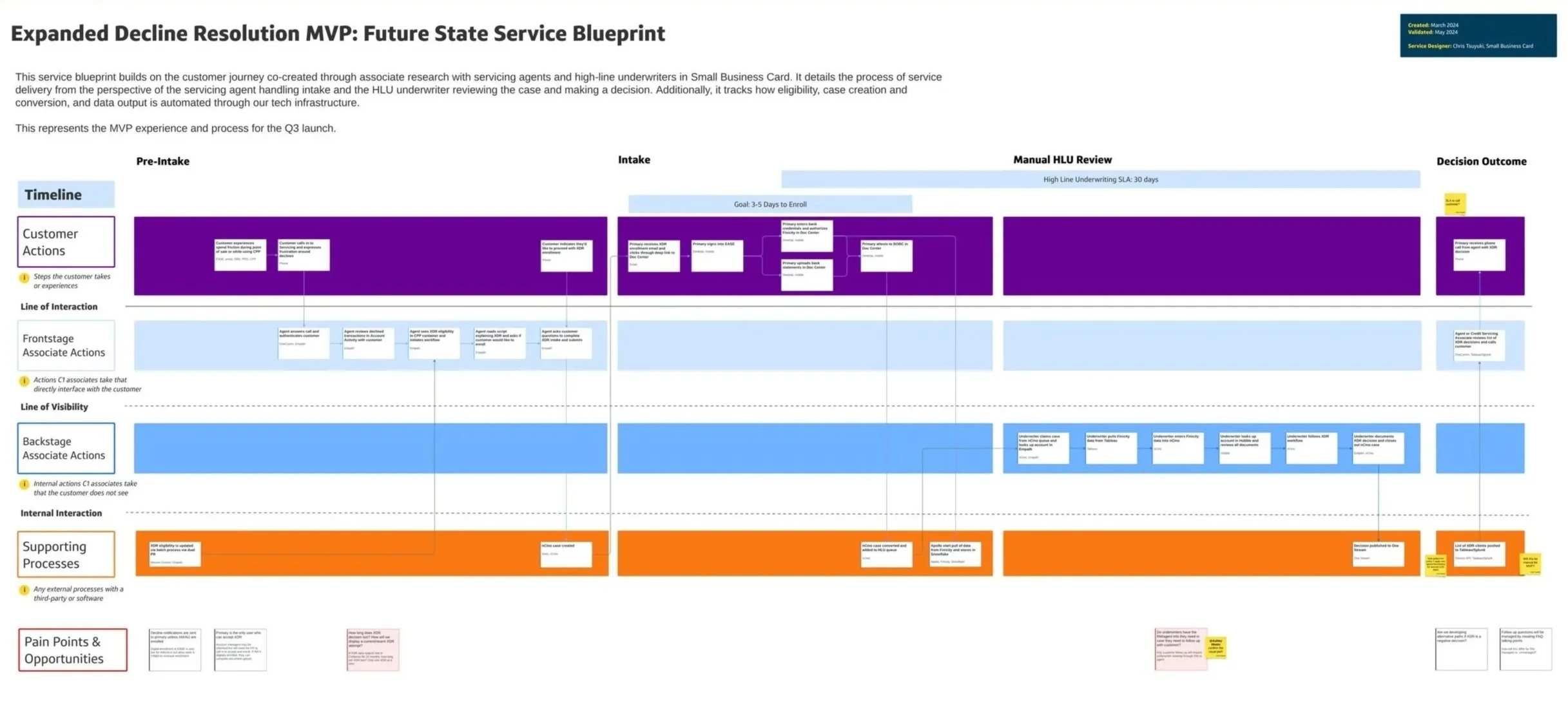
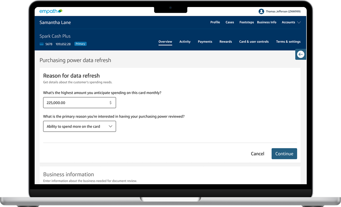
Once we identified the changes required to make XDR successful, I mapped where design updates were needed across the experience. Some areas, like the Document Upload page, required only minor refinements, while the agent servicing portal needed entirely new end to end flows.
I designed the entry point and core flow for this new tool on the agent portal, partnering closely with business and underwriting to ensure we captured the information needed to make confident decisions, including context for the increase and critical business details. I also worked with our third party integrations team, Finicity, to shape the experience and content in a way that clearly explained data usage and helped customers feel secure sharing sensitive financial information.
To support adoption, my team partnered with Servicing Operations to create agent documentation and training materials that addressed common questions and enabled a smooth rollout.
Leading changes on our servicing experience
Understanding ideal vs recommended solutions
Given our delivery timeline and the effort each change required from partner teams, it was critical to make intentional tradeoffs. We prioritized delivering meaningful value to customers over achieving a perfect MVP. As I designed the agent servicing portal flows, I relied heavily on existing design system components to balance an intuitive experience with speed to market.
One of the largest tradeoffs was how we surfaced case progress. The banners available to us only supported generic messaging, and technical constraints prevented agents from sharing personalized status details or allowing customers to track progress in their online portal. While the experience was not ideal, it provided agents with enough context to support customers without adding weeks to the timeline. We documented decisions like this so they could be revisited and improved in future iterations.
Creating an open feedback loop with agents
Because this was the Small Business team’s first time launching a program like XDR, and we had made deliberate tradeoffs to meet our timeline, we prioritized establishing clear feedback loops from day one.
I helped plan and design an always available feedback form so agents could quickly flag issues or share observations as they arose. This allowed us to collect ongoing qualitative input to inform future iterations. As the feature rolled out, we also spent time shadowing agents to observe how they moved through the XDR process, when they introduced it to customers, and how customers responded.
In parallel, design and product partnered to define success metrics, including document upload completion and whether customers who completed the flow reduced follow up calls to servicing.
Planning the future of XDR
Looking towards the future of XDR
After various delays and challenges the team overcame, I was excited to design QA the build! This essential step helped ensure the customer experience going to production matched the experience I envisioned. Given our challenges, not everything was going to be the same, but through our constant communication, we were able to deliver an experience that got as close as technically feasible. In QA, we discovered some minor errors related to spacing and text, but those were quickly corrected, and we were able to release!
New changes to a beloved feature
Main changes
Accessibility Updates
Ensuring our features are accessible and intuitive for all users is always our priority. Updating Cover Purchases to enhance usability was crucial. By consistently displaying all relevant information and positioning error messages directly next to the issue, we’ve made it easier for assistive devices to interpret the content, significantly improving the overall user experience.
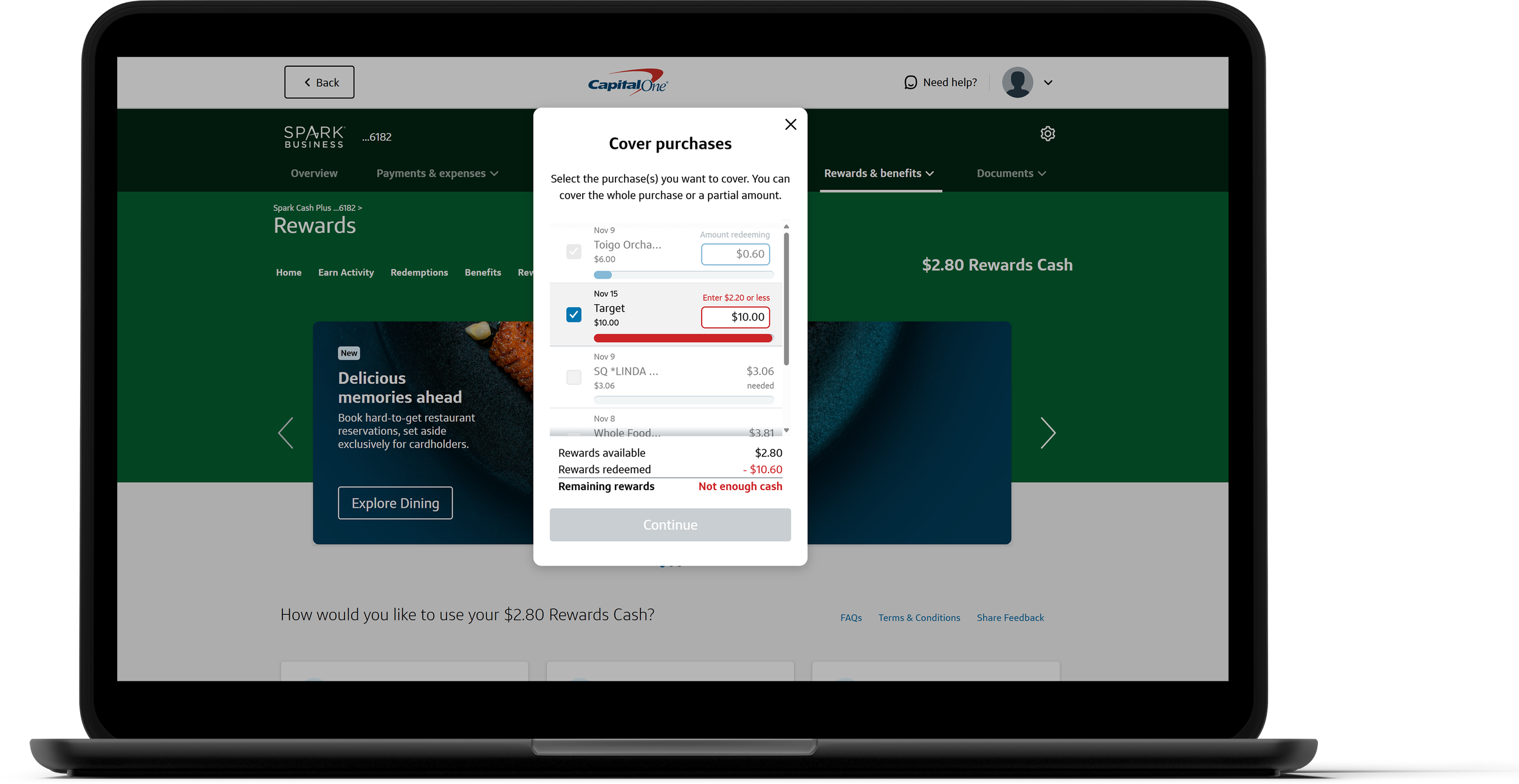
Covering Multiple Purchases
Our updated, user-friendly design allows customers to cover multiple purchases at once, reducing redemption time and boosting overall efficiency. For over 60% of Small Business customers, this means a faster, more satisfying experience that makes redeeming rewards simpler and more convenient. This change was only released to Small Business customers.
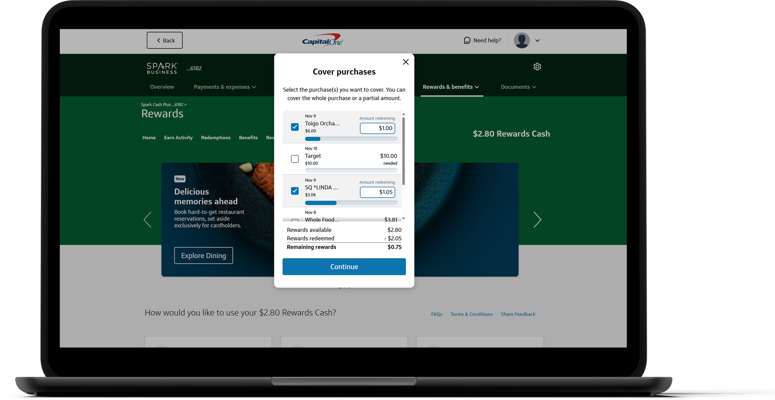
Transaction Table
The transaction table provides users with a clear, comprehensive view of their rewards usage, displaying the total of all selected purchases in one convenient place that reduces the need for mental math & risk of errors. This empowers the user to make the right decision for their account with confidence. It also uses a familiar pattern for many people, especially small business owners.
Cover your purchases!

Have a Capital One credit card? Cover one (or more!) of your purchases and experience the entire process in real-time, directly on your account!
Reflection
This was the first project I led from start to launch, giving me valuable experience not only on the design side of the work, but also on how to better influence decisions as well as communicate and partner with the developers on the tech team building my designs. Working to understand the needs of my tech team let me tailor the documentation to their needs, ensuring a smooth handoff experience.
This project also taught me how to be flexible, proactive, and influential. There were a lot of bumps along the way and a part of my growth as a designer was navigating those ups and downs. Whether it was the fact that some of our design components weren't available yet on the developer side or that there were too many back-end complications to launch the mobile designs, these conversations and moments improved my ability as a designer. This led to a better understanding of other parts of the business and how different parts of the company come together to launch a new feature.